So I searched for a doodle frame or tag and came upon this fabulous website: Delicous Scraps. She's exactly what I was looking for. There's a ton of free doodle tags, plain pattern background wallpapers.
Here's a few things she has to offer, for free (click on picture to be taken to the download page):
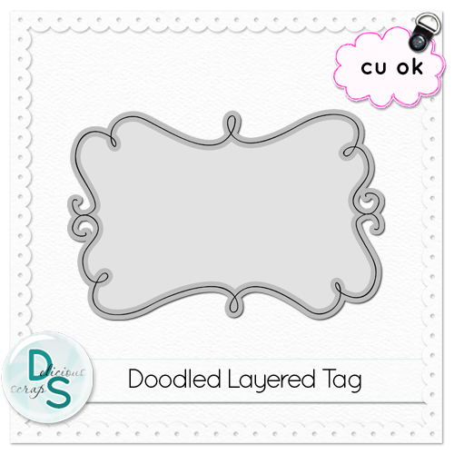
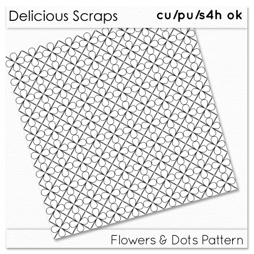
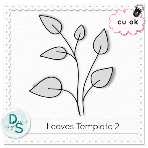
And if there's something you like that isn't listed for free, it's just 99cents in her store!
In the end, I settled on this doodle tag of hers.
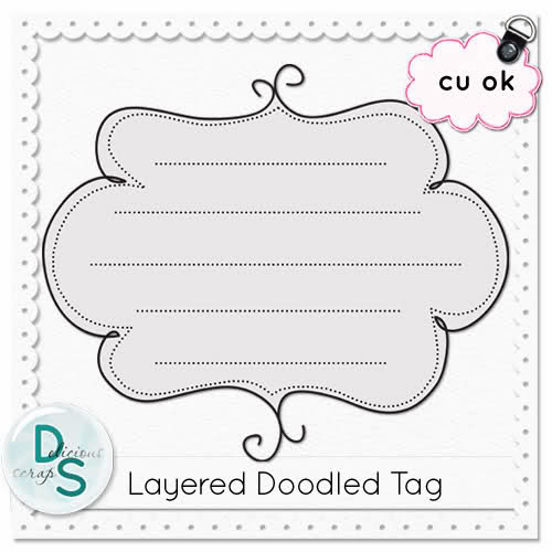
I did 4 different layers of the solid border tag from the 3 main colors of my pallette plus the black/slightly paler underline. And I added the other 2 colors from my pallette as the dotted borders, which are way less dominant, and actually hard to tell the color, but I find it finishes off well.
I wrote in the blog name with the font Simply Glamourous. I love how the capital letters are so big and fancy. I tried a few different fonts before this one, but once I tried this one I knew it was the best and I didn't need to look anymore.
I wanted to give the letters a bit more dimension so I copied the font layer and put it in the back of the first moving it slightly to make the lettering bolder and changed the color to a paler version. I often do this to text to make it pop more.
And then I had a logo:


No comments:
Post a Comment