Logo Graphics

I never had a real logo for my last blog design, and I really liked it when others had a clear cut one. So from the start I knew I wanted a certain shaped with the blog name written inside it. But at the same time that sounds very plain, and the last thing I want is plain.

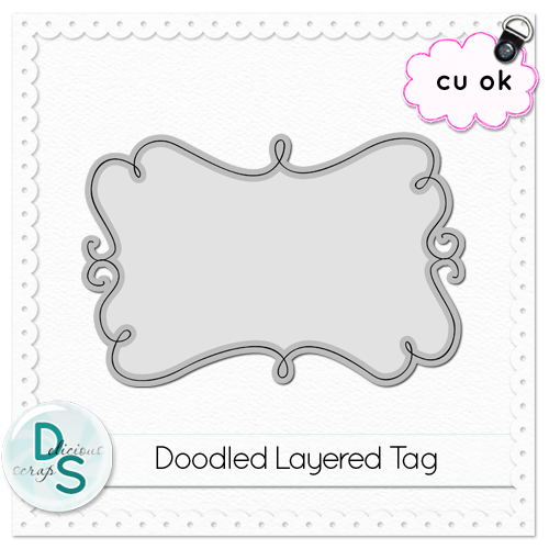
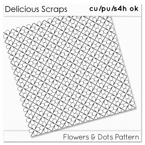
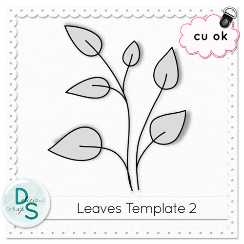
So I searched for a doodle frame or tag and came upon this fabulous website: Delicous Scraps. She's exactly what I was looking for. There's a ton of free doodle tags, plain pattern background wallpapers.

Here's a few things she has to offer, for free (click on picture to be taken to the download page):


And if there's something you like that isn't listed for free, it's just 99cents in her store!

In the end, I settled on this doodle tag of hers.


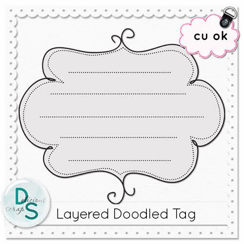
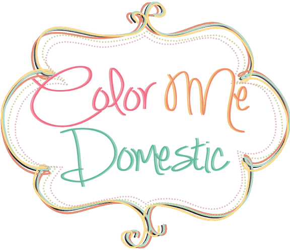
I did 4 different layers of the solid border tag from the 3 main colors of my pallette plus the black/slightly paler underline. And I added the other 2 colors from my pallette as the dotted borders, which are way less dominant, and actually hard to tell the color, but I find it finishes off well.

I wrote in the blog name with the font Simply Glamourous. I love how the capital letters are so big and fancy. I tried a few different fonts before this one, but once I tried this one I knew it was the best and I didn't need to look anymore.

I wanted to give the letters a bit more dimension so I copied the font layer and put it in the back of the first moving it slightly to make the lettering bolder and changed the color to a paler version. I often do this to text to make it pop more.

And then I had a logo:

Continue Reading...

Pages Navigation: Graphics

Continuing from where I left of in the last post about Pages Navigation organization... Now that I know what I want the labels, or pages, to be, I also had a very defined way I want them to appear and look.

I wanted them to look like file tabs, like in filling cabinets, but also be a bit whimsical and not the simple file tab shape we're used to. After some doodling on a piece of paper (I'm not very good at hand drawing things, or being creative with drawing), I managed to draw up some pretty cute looking tabs, don't you think?!


I scanned the piece of paper and opened it up in photoshop. I wanted to try to extract the shape somehow, but that didn't work out too great. I tried selecting the shape (ctrl + click on the layer and it selects the black part) and then painting the selection black, but again that didn't work very well.

So in the end I ended free hand, or free mouse drawing over the shape I had scanned. I was also able to correct when it wasn't quite as smooth as I wanted. I also tried a few thickness and settled on the medium one. It was more pixelated than I wished it was, but once it's the size you see on the blog, then it really doesn't show that much. This makes me want to try making vectors instead, then I wouldn't really have pixels. But I don't want to learn that right now, so this will have to do.

Then I wrote in my tabs, with the font Pea Ashlee Renee I made the font as big as I could while keeping it uniform for all of the labels.

Finally every label got treated to a bit of color by duplicating and coloring the tab doodle, and tilting it a bit so the black tab also shows underneath. I tried just having the colored tab but I dunno, I find with the black one in the back it gives off a better doodle vibe, which is what I really wanted.


The only thing I'm not entirely happy about is that because I freehanded the tab outline, it's a little pixelated and not as smooth as a vector art would be. I'm looking into doing the doodle with Adobe Illustrator, which should help make the outline more fluid and hopefully less pixelated.

Anywho, the real magic of these tabs is in the coding and behavior of these graphics on the webpage. Normally, they appear a little transparent, so that they don't command too much attention, but are still visible. But when you hover over them, or click on them, they become fully opaque (no transparency) and move up just a bit. It was super easy to do, too, just change the positioning and transparency on hover! Go ahead, try hovering over them or holding down your finger on them. I'm pretty proud of myself!


One part of the header down, 4 to go!
Continue Reading...

Pages Navigation

Last time, I talked about blog content organization, and I mentioned the pages bar, briefly.

To recap, I'm making a few pages, you know, those essentials that aren't quite blog content, but still essential or expected. I'm talking About and Contact, Buttons page and Parties and Features page that I decided to present as pages to free up some valuable sidebar real estate. They are nice to have, but can be quite cluttersome, so having them out of the way at the top and bottom as individual pages seemed like a smart move. I'm really hoping they will be easy to locate, especially the button page since it's less common to have them as a page, but not unseen. Well ok, I'm really still on the fence about the buttons page. It wouldn't take that much space in the sidebar section, but at the same time how many people actually use the button? TBC...

Quite a bit more unconventional is seeing a resource page and an archive/sitemap page, but I wanted to create them. The resource page because I want to give credit to the wonderful (mostly) free digital art I use around the blog; we're talking fonts, shapes, tags, doodles, paintbrushes, etc. The Sitemap I'm still a little on the fence about it, I love sitemaps for Wordpress blogs, gives an other way for people to find your content the way they want to find it (archived in chronological order, or by label/category), and includes ALL your content. Every single page.

Those are the 6 pages I'm planning. Sometimes you also see a Home tab with them, but I find that redundant seeing as the header or logo should point to the home page of a blog, or website. I really hope it doesn't confuse people, and I'll see if I need to add it later, but really the more I think of it, the more I think it's just convention for it to do that, so I don't see there being a big problem about this.

Not everyone separates their pages tabs from their content navigation tabs, but the blogs and websites that do do that have really attracted me lately. Actually, a lot of them have the pages bar at almost the very top of the blog page, sometimes above the header/logo, and then the content navigation below it. That's what I decided to do, even if I don't have that many pages, or categorical navigation to showcase.


I'd also like to have simple text links of those pages in the footer section of the blog. Websites do it like that, and I think it's expected to have links to that kind of information at the bottom of a page, too. The footer is often under utilized and neglected, but really when someone gets to the bottom of your blog you don't want that to stop them from continuing finding more stuff to read, so it's really quite logical.

Wait til you see what I have up my sleeve for graphics and coding for these bars, I'm really excited about them!!
Continue Reading...

Blog Content Organization: Navigation

Everybody's got their own way of organizing and displaying their content. Some do it well, some not so well (just a fact...). Nothing frustrates me more when I find a blog post I really enjoy than not being able to find more content to enjoy on that blog. Needless to say, I don't stay there very long.

So far, I've been trying to divide up the subject of blog content organization. It's such a huge portion of the blog, and quite multifaceted when you start thinking about it. And sometimes one doesn't realize just how much thought does, and should go into planning it well, because it's more "behind-the-scenes" stuff.

But here's what it really boils down to: can your readers find more posts to read on your blog? How easily can they find it? Is it intuitive? Is it well presented?

And here's a really big blog pet peeve of mine: I hate it when people slap on a label page for navigation in the navigation bar. Whether it be for a series or a category, it just looks awful and is so hard to navigate and find what you are looking for.

Here's what I expect from navigation, and you can very well disagree with me, but I think navigation should show you a glimpse of the content, as much of it as is relevant to know whether I want to read the post or not, without seeing the whole post and without having to click through pages and pages of archives to see more. And that's exactly what labels don't do.

A label is just a filter really, only displaying the posts with that label, and displaying all of the post. Unless you have truncated posts, which in that case can make it manageable to browse through as long as it's just a small snippet, labels are awful IMHO. And labels are already there in a widget type thing most of the time on a blog. If I wanted to view posts in this manner (which I personnaly don't) I would click on the particular label. When I click on a navigation menu, I expect to see a list of blog posts pertaining to that subject where I can CHOOSE which ones to read with ease. Also, it really helps not to have to load all the content, and pictures, you don't want to read.

That's my 2 cents on the matter, and that's how I'm choosing to display MY navigation, or well how NOT to display my navigation. Navigation takes work, and there just is no adequate shortcut for it. So at the very least, have a Project Gallery, and if you feel up to it, further separate and sort your content for easier navigation.

As I mentioned in the last post, I'm going to display my 3 main categories in the navigation bar upfront, one beside the other, then when you click on one it will open up, in a drop-down menu, the rest of the sub categories.

And here's where you need to consider touchscreens. There are no hover effects on touchscreens, so if you set your drop-down menu to open up on hover, it will not work on tablets and smartphones. I've recently come across this problem on my new tablet. It's a pain not being able to open up the drop-down menu. The only thing that makes it better is when at least it opens up a page where you can see the sub-categories and choose on. And again where labels DON'T work.

I need to look further into how to make a drop-down menu that opens when clicked; I'm sure it can be done.

I still think labels are a good idea, but they shouldn't be used instead of proper navigation. They should be their own separate navigation system. You often see them in the sidebar, which is where I'm probably gonna put them, but I'm also considering putting them in the footer section. I haven't decided yet. I'm working from the top down and I'm still in header mode.

An other thing is that I want to separate my navigation into 2: actual posts navigation bar (detailed above), and a pages navigation. I'm talking the About Page, the Contact page. Things that don't evolve over time (too much... ie static), that don't really lead to much content, but that are still quite essential and expected in a blog.

I've seen this done more and more on blogs and I find it very well presented, so I'm implementing it on my own blog.
Continue Reading...

Blog Content Organization : Labels and Categories

Content organization is something you want to start thinking about early on in your blogging journey. The sooner you start, the easier it is to maintain, the more likely you are to get started and keep it going. No one wants to organize 100+ posts worth of content in one shot; ok maybe some people who love to organize (I started when I had about 40 posts because that's when I started to have enough stuff to organize into categories). If you want to just dab your toes in it to start, I recommend a Project Gallery type of page. You don't need to categorize yet, but all your projects are in one place and easy to navigate. But after a while, you'll want to start separating your content a bit more.

If you are on Wordpress, you're very lucky to have Categories and Labels. Oh how my organizer self would love that! But alas, I'm still on Blogger, so it's all one jumbled thing: Labels.

The way I use labels is I have category labels (craft, DIY, org, tips, blogging, personnal, and the like), sub-category labels(season/holiday craft, sewing, office org, kitchen org, food tips, tech tips, etc), material labels (paper crafts, wood crafts, paint crafts, etc), room labels (kitchen, bedroom, bathroom), and I think that's pretty much it for now. If at some point I see that there are a few posts that have something in common, I can easily just add a label to group them together.

Having them organized, or knowing how you want to organize them, is one part, the first line of defense if you will. The other part is knowing how to display that. I'm doing a navigation bar in the header section of the blog for sure, separate from the pages navigation. I'm probably gonna scatter some other organization in the sidebar and footer, but I haven't quite decided what will be where yet. One step at a time!

Blogger also provides a couple ways to display your organized content, Archives that organizes by date, and Labels that simply displays all your labels. That's probably what I'm going to use in the sidebar and/or footer. But honestly, not many people search with labels, which I'm not surprised, it can really be overwhelming!

Which is why I want to use the header navigation efficiently as the main way for readers to browse my content.

You can display whichever categories you want in the navigation bar, but personally less is more and I want it to be concise. I thought the best way to do it would be to have the big categories displayed outright, which then leads to the sub categories (either a drop-down menu or on the page that is linked). If I put the sub categories up there, then I think there would be too many and it would just be overwhelming; again personal preference, as I really love hierarchical categories (categories within categories, and so on...), it just makes sense in my mind.

But I'd prefer not to rearrange my whole hierarchy of categories and sub-categories every few months. This has been rather hard for me, coming up with categories that are broad enough, but also distinct and intuitive enough that someone else would be able to find what they are looking for.

I haven't yet decided if I'm just doing one single page (like the project gallery), and then those links in the navigation would be anchors to sections on that one page, or different pages for the main categories and then anchor links to the sub-categories sections. I just don't have too much content, but I'd like to plan for the future at the same time. Decisions, decisions.

Here's where I'm at so far: 3 main categories, with their sub-categories in parentheses:

1. Craft and DIY (seasonal and holiday crafts individually or together, sewing, crochetting, decor, wall art, built it)
2. Homemaking (organization, cleaning, recipes, tips for the home, green living, thoughts in general)
3. Technology (tips, blogging, apps, social media, etc)

Here's where I go back and forth. Do I split the main categories more? Crafts could be one, DIY an other, it's just hard sometimes to seperate the 2 (like my sunburst mirror, is it a craft or a DIY? it's definetely decor though). Basically, to me Crafts and DIY, covers everything handcrafted.

Then there's Green Living that could be an indivudual category, but I also think it fits well with the homemaking global category. This is more things you DO to make a home, rather than MAKE, you know? But there could be some overlap, say if I make reusable ziplock bags, which is sewing and green living, but I think that's ok, too. It's just because of my green series I did in October, I have a lot of green posts! Though they are mostly round-ups.

The Technology category is basically a main category because I didn't think it fits anywhere else, but it's still something that I like to cover, just not as heavy as the other categories. Technology just englobes everything we do, not just homemaking, hence why it's its own category.

I dunno. Some I'd like to take out of sub categories and make main categories, but they ARE sub-categories, and then if I make THEM main categories the other sub categories will feel unloved :( lol Am I putting too much thought into this? Probably...

TBC...
Continue Reading...

Blog Content Organization: Project Gallery

Blog navigation, to me, is one of the most useful, and essential part of a blog. You want any readers coming to your blog to be able to find more stuff to read, which means more pageviews for you! So you have to help them find what they want, and more importantly, what they didn't even know they wanted!

At the beginning of your blog journey, you're gonna dab in a bit of this, and a bit of that. You may not know what your categories are, and you may not want to commit yourself right away. That's ok. I suggest you start a Project Gallery as soon as you can, though! You don't need to categorize, but as long as readers can easily find all your blog posts, that's what you want. Have a thumbnail of your most descriptive image, and your post title with it, that will suffice.

My Project Gallery was one of my 4 navigation buttons in my first blog design, and I think it really helped readers to find more content they might be interested in.


I've been using InLinkz Project Manager (formely Link Manager)(which is now unfortunately no longer free, but for 12$ a year I paid for it) to manage my Project Gallery. It does it all for me without me needing to code anything, just need to enter the information. Only thing is that I don't know how it will work with my responsive design, so I might need to change that out.

It doesn't matter how you do it, but as long as you have all your projects on one page, with a descriptive image and title, your readers will be happy. I say have both the image and title because I'm visual and I decide what I want to read most of the time based on the image, but sometimes I need to read the title to know what it's about, and sometimes it's the title not the image that intrigues me. Give your readers choices, not everyone browses the same way, and there's nothing wrong with that!

After some time blogging and x number of posts, you'll start seeing a pattern and categories will start to form themselves. That's when you want to further categorizes and sub categorize your posts. I'll talk about that next post.

Continue Reading...

Choosing a Color Palette

I mentioned a while ago now that I wanted to write about choosing a color palette, but have been putting it off because I wanted to code more. Now I want to get it out of the way.

Now, all time I designed my blog I chose a scrapbook kit and that pretty much dictated what my color palette was going to be. This time around, all the elements I found that I liked were just plain overlays, doodles, etc that were just borders without a predefined color.

Also, maybe I didn't find a scrapbook kit I liked this time around because the color palette was off. Anyway, I had to choose my own colors to design with. Where to start??

I looked through Design Seeds to find a scheme I liked. I copy pasted the ones I liked into OneNote. I quickly realized that the other I liked were very colorful, and not shades of the same color, or couple of colors. Not surprising, I LOVE color. The more the better.

The thing was that I wasn't satisfied with any one image and color scheme. I wanted to mix and match. But that doesn't always fit together. I picked one image that I liked best and that I wanted to use the most of its colors, it was this one:


I started an image in photoshop a made circles of the colors. Then I went and found more images, that already had at least one of the colors I was looking for, and others that weren't in the first image, and copied their colors into the same photoshop major collage, as I'll call it. I must have used about 10 different images, and in the end I had this collage of colors:


Naturally, that was way too much! I had a hard time finding the right green and blue. So I picked the ones that were my favorite, then crossed out the colors that didn't match well, or were slightly off, and in the end I ended up with this smaller collage for a color scheme:


Still, 9 colors is a lot!! But there are 5 (or is it 6?) major colors, and some tones of the main/favorite 3. I plan to/have been doing my design mostly around the 3 main colors: the pink (my very favorite color in the scheme, thought it would be the orange, but no!), the blue, and the orangey yellow. The pruple and the green are more for when I want more colors instead of more tones (I'll use them when I need to make a list of similar elements, like the follows buttons). They are the colors that are featured prominently in the logo, which was the first piece of graphic design I made up, and what's setting this tone for the rest of the graphics.


I'm still debating whether I do a rough tutorial for how I made the header graphic. I played around with photoshop until I was happy, mostly, but maybe there are some tricks one might find helpful if they are doing their own graphic elements (FYI, I am not that great with photoshop, or graphic design...). At the same time, I don't want anyone copying my effect, so yeah... If you got any questions as to how I did it with photoshop (I think if you look at the graphic long enough you can see what I did) just ask in the comments :)

So with that, the theme I'm going for is: doodly, swirly, colorful, fun, whimsical. At first I thought I'd be outlining everything in black, but as I go along I find myself removing that aspect more and more- it's just too harsh. I'm still using it for some elements, but dulling the blackness down a bit, either by using a more charcoal color, or just simply decreasing the opacity of the black layer.
Continue Reading...

Header Layout

When I started thinking about this new blog design, I knew I wanted to make better use of my header. The space above the fold is very precious real estate, it's the first bit of your blog a reader sees, it sets the tone and feel of a blog.

As much as I loved my old header, it was just an image, and it was not very useful in any other way. Ok, I did have a menu below it, that was useful, but that's it.

It's become more and more of a trend to put different elements right within the header, for ease of use to the reader. Social media icons, email subscription, search bar are all a common part of the header nowadays.

But I also find that everyone does it the same way. I wanted to incorporate more into the header, but make it different than what we're used to seeing on other blogs. I needed take it up a notch, and make it just a little more fun.

I also gave a lot of thought to how the various elements in the header would rearrange based on the screen size; for big screen PCs, tablets, and smartphones. I might just be really complicating things! We'll see. I've been putting off tackling the header because of this; I just don't know if and how it will work.

But enough procrastination, I had to start somewhere.

First things first, allow more gadgets into the header part of the blog layout. This tutorial will explain how to do that, and a little more. Easy peasy. Then you have to tweak the sizes and play with floats as you add new gadgets to make it go where you want it to.

What I decided to add to my header are the following: logo, pages menu, tagline, social media buttons (including follow buttons RSS and email), search bar, and navigation bar (for content, as oppose to the pages menu).

Don't get me started on knowing to do a pages/menu bar, vs/and a navigation bar. I've thought a LOT about how to organize the blog, and I might still change things around; I'll probably write about that at one point. Navigation and blog organization is a HUGE thing for me!! And it gets all the more trickier with responsive design.

So, after a lot of thinking, at non appropriate times... (it really gets all consuming this blog design thing!), I've come up with the following layout for the blog, at desktop resolution:


I know it's busy. But hopefully I will be able to make it really pretty, functional, and... flowy, for lack of a better term. There's gonna be lots of trial and error!!

Now that that's done, I gotta do the graphic elements for the different parts. I'm a real big fan of hover effects, but I'd like the hover effects to be achieved with CCS(3), so I don't have to have 2 different images, and so it saves on load times. I've got a lot of great ideas, especially from this article: . It. will. be. AWESOME! I'll also probably be using effects like opacity, background color (with transparent elements in the image so the background shows through), make an image bigger.

BUT, and this is the sad part, I recently realized that tablets won't be able to see all my cool hover effects. sniff sniff. I'll probably try out the :pressed pseudo class (pseudo element? can't remember which is which right now), at least there will be the hover effect for the split second someone touches the button on a touchscreen. And probably :active too. Same effect at active as hover and pressed. That is the plan!

Now the thing will be not to overdue it. I think there's gonna be a fine line, and I'll probably be walking RIGHT on it's edge. I REALLY LOVE hover effects!!

TBC...
Continue Reading...

Choosing Media Breakpoints

One thing that has been nagging me in the back of my head and prevented me from moving forward is that I wasn't sure of the layouts I wanted to get for different media devices. I didn't know how many breakpoints I wanted, or where those breakpoints would be best situated.

Sure I've read of some in articles, they mostly reference the iPad and iPhone, and well, I'm kinda anti-Apple... So I didn't want to base myself on them but rather on actual resolutions.

So I took the time to look through my google analytics for my blog and see what people are viewing my webpage on. In my mind, I saw a total of 12 different possible breakpoints from all the data I analysed. Yes, that is a lot!! And I cannot create all of them, or well not all of them right away. I don't know if they will all even be necessary in the end, it will depend on where I go with the first ones. My goal might be to one day have the blog optimized for all those breakpoints (which seperates landscape and portrait in some cases).

I've read many an article saying to start responsive design at 320 and work your way up. Well, I don't have a smartphone, I cannot design for it right away, right off the bat. And besides, it's not the biggest chunk of my pageviews. It's still much more logical to start at a normal size screen. What is normal size? Well, it would seem between 1280 and 1439 px wide. Which is my work laptop. I'll make everything responsive so it'll pretty much fit any screen without a scroll bar in sight.

Then I'll go to smartphones, below 320, or maybe below 480 to start with, then redefine those later...

Then it'll be optimized for the iPad in portrait mode, or portrait below 1000, and above 480.

Then for big screen larger than 1920.

Then we'll see. Ideally these are all the breakpoints I could imagine myself doing (in size order):
1) <300 both landscape and portrait(cuz these are almost squares), but there are very few it would mostly be for older phones 2) >301 <479 portrait 3) >480 <599 portrait 4) >301 < 601 landscape (could be divided into 2 if I'd really want to, this would be the very last resort though) 5) >600 < 1000 portrait (tablets' most popular resolution) 6) >600 <1023 landscape 7) >1001 portrait (maximum size for portrait)
8) >1024 <1279 9) >1280 <1439 (most popular resolution and default one) 10) >1440 <1919 11) >1920

So yes, lots of work ahead of me!! If I choose it. I just really needed to know the grand plan to be able to devise how I want my header to rearrange, because it's gonna be the most complicated part to code I think. I've got such grand plans indeed for it! But the more I read, the more I realise not quite everything is possible here. Especially if I want it to be responsive. It would be easier if I just wanted it adaptative (pretty much fixed size but changes layout on breakpoints). I don't want to start working on the header layout just to realize something is not possible for the smallest viewport and have to recode everything.

It will be epic!

TBC...
Continue Reading...

Translucent Backgrounds and Round Corners

One of the rules defined in CSS3 is opacity of background images. The moment I read that I knew I'd be taking advantage of that feature to do something I had in my head.

I wanted to make my outer-wrapper container translucent, so that it frames the entire blog but still shows a bit of the beautiful background I've got going on. So I set the color to white and then added the little bit of code for opacity. Easy peasy! Right?!


Wrong! Turns out, this affects everything inside the container. All the text all the images are now also transclucent. Not what I was going for!! So after a bit of digging, it turns out the best (only?) way to do this is to create a transclucent png image and use that as a background image.

So I just created a small wide transclucent white image to use.

I used the same CSS code as for my body background. Size 100%, fixed, repeat y, and voila, that's what I wanted!


Yet, I don't know if it looks all that right. I'm leaving it for now, we'll see how it works as I add graphic elements like the header graphics etc.

Ok, one more thing here, I'm adding round corners to my containers. I just really don't like how square corners look, here or in real life. When I do wood projects, I pretty much always sand down the corners and edges so they aren't perfectly square.

Following this tutorial: Rounded corners using CSS without Images.

Of course things are never that easy. I should have seen this coming. Rounded corners are a property set to borders, which means I needed to add a border, which I don't necessarily want. So fine ok I set it to white, the same color as the background, it won't show.

But then I forgot that adding a border to a container contributes to it's width, and since I already took up all the available width as I mentioned in my last post, so the sidebar fell off below the main post area. Easy enough fix, remove 1% from one of the widths. Now I just hope it doesn't break at a small screen size.

Continue Reading...

Responsive Design: Setting the Widths, and Background Color

So I was gonna do a post to say I needed to add a background color (white) to the parts with writing: post, sidebar header, then as soon as I did that I realized I needed to play with the margins and paddings, which need to be in % if I'm to do a responsive design, so what the heck I'm gonna start the responsive design thing right now with the width of the containers. Good place and time as any to start.

So yes after a couple of lines of code to make the backgrounds white to be able to read properly, I get this:


And then with some adjustments to the width and padding of the main containers (header, outer-wrapper, main and sidebar), I get this:


And it's already responsive!! I've also been coding my images inside my posts to be responsive for the long run. They are set at width 95% so they take up as much space as possible.

So here are the dets for the containers. As of right now, my outer wrapper is set to width 80%, my header width 96% with 2% paddings on each side (so total 100%), my main post area is 65% with 3% paddings on both sides and 1% margin on the right (for space between it and sidebar) (so total is 72%) and my sidebar is 21% with 3% paddings on each side and a 1% margin to the left (total 28%). Yes, I played around a lot with those #s to get what I wanted, and it might still change as I add the graphic elements and other features.

The thing to remember when you are setting these widths is that the % is based on the size of the PARENT container. outer-wrapper is inside the body (which is the entire window), header main and sidebar are inside outer-wrapper. Setting the widths of the header is easy because it takes up the entire width of the outer wrapper, but main and sidebar share the width, so their total width needs to fit inside the outer-wrapper. It's really quite easy once you get that concept down. And also remember that paddings and margins need to be counted towards the width. If it equals more than 100%, it won't look right. It won't be cut off but it won't look right.

If you're not sure what the difference between margin and padding is, check out this article from Blogger Buster. But quickly, margin is the space outside the container, and padding is the space inside the container.

You can try out the responsiveness by resizing the browser. Everything should adjust and fit as the screen gets smaller or bigger. Of course this is just the beginning for responsive design, the very base. I'll be adding media queries so that the layout changes as you get smaller, to better suit tablets and smartphones. I'm so excited for that!!
Continue Reading...

Setting the Body Background Image

The background image, or graphic, was one of the first graphic elements I made for the new design. I knew I wanted I pattern, and for it to be predominantly white, yet still quite colorful.

I'd found this graphic designer, Delicious Scraps, and I loved her stuff because you could use them to create your own graphics with them using your own color scheme. Perfect! Exactly what I needed since I hadn't yet found a scrapbook kit with a color scheme I liked and elements I was longing for. And I can pretty much guarantee no one else will have the same background as me!

So, first order of business: make the background image. Oh wait, back track a second. First order of business: choose a color theme!! Ha! Ok, well since I've already started with this post, I will cover how I chose my color scheme in an upcoming post, that sound good?

Ok, second order of business: make the background image. I looked through all the free pattern templates at Delicious Scraps and chose the one I liked best. This one to be precise:


Curtesy of Delicious Scraps

I wanted each layer of circle flowers to be a different color (the solid vs the paller one), and the dots an other. They all come in different files when you download the template. But I could not figure out intuitively how to do it in Photoshop! I thought I'd be able to do it with the overlay property, but it did not give me what I wanted at all!!

So I turned to all mighty Google, but I wasn't sure exactly how to phrase what I wanted to do. My first couple of searches came out fruitless, and I was almost ready to give up when I came upon this tutorial (for digital scrapbooking). I almost discard it because there were no pictures and it was using a different version of photoshop than me, but I figured I'd better try, and it worked!! Exactly what I wanted!!

I was now able to color every layer a different color, and because they had a transparent background, I could easily put them one on top of the other. Hooray, background graphic: Check!

With the background image in hand, I had to figure out how I wanted to place it. Here's a good tutorial to know your choices: How To Use a Background Image for Your Blog .

I wanted my background image to be scalable, proportional to the width of the window of the browser, since I'm going for a responsive design. I don't know if I'm making sense... I knew from my past (current?) background image that it looks slightly different for every device/resolution seeing my blog; it's set to background fixed and no-repeat. Someone with a big screen/resolution (Desktop computer) would see quite a bit of the colored part of the background (right, below) and that's the way I intended it to look like when I designed it; whereas someone on a smaller screen/resolution like a 15" laptop (my work laptop; middle, below) would have the background cut off where the lacey borders are and barely see the rest of the colorful background. And who knows what someone on a tablet or phone would see, probably not much if it follows the trend. (Note to self, check on bf's tablet and iPhone)

Click to enlarge in LighBox

The point is, I don't want the flowers to look huge in the background of a smartphone. Which is what I think it would do if I code it the same way as I've previously coded it. I also needed to figure out the biggest size of monitor it would be seen on. If I didn't make the image wide enough for the biggest screen, then there would be white space somewhere to compensate.

With that in mind, I thought my best bet would be to make the background image itself responsive, but was it possible? Apparently, with the new CSS3 rules, it is! Check it: CSS3 backgrounds. It would still mean that anyone with an older browser would not see it properly, but I think the majority update their browsers, right?

So here we go. Try 1, I set background image to fixed, no-repeat and a width of 100%. BTW, the image I made is 2000 px by 1000 px. And I always prefer fixed, I don't like it when it scrolls, I find it too distracting, especially when it's a busy pattern.


Please don't mind that the text is unreadable now. I'm fixing it after, and it's quite easy: just color the background of the main sidebar and header containers white.

Problem numero uno: If you're on a widescreen viewing the blog, the background isn't tall enough to cover the whole height of the screen! Which means the background image needs to be higher than it is wide for widescreens in landscape mode. But, thinking ahead, for portrait mode, then I would need it to be wayyyyyyy higher than wide, which would make for a huge file. There's gotta be an other way. (If you see how to fix it at this point, unlike I did, you can skip to the end ;) )

Try #2: Let's just see what it would look like without specifying the width 100%. (I'm really kicking myself for not thinking of the right fix!!)


Ok, well it fixes the above problem (I think, can't check on more devices...), but I don't like the size of the flowers, I really liked them smaller. And anyway I really want it responsive. Even if I were to adjust the image to have a higher density of flowers, it wouldn't scale.

At this point, I had to leave it be cuz I had other things to do. And then it came to me while I was taking a shower. It was so simple really, why hadn't I thought of it before?

Try #3: background width to 100%, fixed, repeat-y!!!! Duh! If it's not high enough, just repeat the pattern vertically, as long as it is a (seamless) pattern, it won't even show.

And with that, TADA:


Perfect! Actually, I might edit down the background image to the minimum repeating pattern, yet still keep the same width (might also make it less wide, and therefore the flowers slightly larger). That way, the file size of the background image will be smaller, and it should lead quicker. The background image and header image are the biggest graphics of my current blog, and what slows it down a lot right now.

One of my objectives with this design was to minimize the loading times by optimizing the images (not make them too big), and using more CSS to do what I want to do. Which is what my next task will be: make a white background for the containers containing text so they are easier to read. That or/and make the container sizes responsive. Should be easier enough.

Ha! Cuz adding the background was so easy, right?!

TBC...
Continue Reading...

Ready Set Start! aka Removing Attribution

Alright, I've finished indexing (indenting?) the basic blogger template. It was Loooooong! Made me think of the wax on wax off exercise, lol. It was fun at first, but it got really repetitive. It made me realize just how many little widgets and links and such goes into a blogger template! I'm glad I'm not starting from scratch.

But it almost feels like it when this test blog looks like this after loading that template:


Complete blank slate!! And no nonsense in the template that I can't make sense of!

So I've noticed a few things in the Layout Mode:


The Navbar and Attribution are in the Sidebar... And I can't move them?


Will need to fix that. I remember seeing a tutorial for removing the attribution on Help Logger, so I'll do that first, it'll be done.


Step 1 of 83475983476958: Done!

I'll label this post footer-tweak because I think the attribution is most often there. Or should I label it widget-tweak, it is a widget after all. I'd like to clearly label all posts from the beginning so I don't need to go back in time and for anyone to be able to find what they want to know. We'll see how that works out.

I'll be working on background next, or maybe making widths responsive, or both. We will see!
Continue Reading...

Gotta Start Somewhere... Or Not

Yesterday, I was finally feeling tired of reading, and reading and reading instead of actually DOING, so I decided it would be the day that I would actually make a change to my base template. There's only so much you can read before you have to actually START.

So you're expecting something to have changed on the template, right? Well, trying to change SOMETHING (I decided to go easy and just add my background) highlighted some challenges that I did not foresee because I hadn't actually LOOKED at my template yet.

I THOUGHT I understood the skeleton of blogger, but then I looked at the head tag, where all the CSS is to add my background code, and I didn't understand a lot of things. Like wtf is .body-fauxcolumn-outer?? (and there where other other like .cap and whatnot) Nowhere in all my basic blogger template reading did I see anything mentioning that tag (or is it class?)!

I thought it might be just the template I was using (The Simple tempalte) so I change to the Ethereal template. Well, the same code was there, so I think it might be just a think with the preset blogger templates.

At this point I remembered reading in one of the articles/series that someone was sharing a very basic blogger template as a starting point. Now in WHICH article was it?? I've been reading blog template stuff on 3 computers, so it's not like I could just go back through my history. I'm pretty good at remembering things based on what the page looked like, so I knew if I could just find the webpage that I pictured in my mind, all would be good.

I'm also trying really hard to save all the articles I'm reading for future reference, either here like I started doing in my first research posts, or organized in my OneNote (but sometimes I have a hard time finding it bc I try to over organize my pages in there).

Needless to say I couldn't figure out which article it was. Well, I knew the articles I was refinding were not it, I knew which one I was looking for but where had I looked at it?? And I was pretty sure I had not yet closed the tab. I finally found it last night. It was on my netbook, the one I use the least often. Good thing I decided to do some bedtime blog reading, or else I still wouldn't have found it! And don't worry I've saved the article now.

So, here's a list of the articles and series that have helped me most understand the anatomy of the blogger template, which is quite different from other templates from what I understand.

1. From Blogger Guide starting with Understanding Blogger Template. There's just a couple of posts after this one also that really help.

2. At Theme Forest, there's this article from Amanda of Blogger Buster as a guide for web designers. This is where I found the basic template (in the middle of the article, you can download the template). It's really quite comprehensive and has great info about widgets and such.

3. This series at Our Blog Template is also very good and clear.

I must have read others, but those were the most helpful to get started and feel a little more confident once I open the blogger template (and also the ones I managed to save). They don't discuss as much WHAT to change, but more making sure you understand the anatomy and know where to put what and what not to touch.

Also, reading many articles, from different authors, really helps because everyone has a different way of explaining. What might click with one article might not click in your mind from an other article. Also, repeat exposure helps.

Even after all that reading, I was still stuck not understanding my template. So I downloaded the one from Amanda at Theme Forrest (#2 above). When I opened it in Notepad, it was all a wide and hard to scroll though document, so I started making Enters and Tabs to be able to read it better.

I found this a wonderful exercise. Especially for the body section with all the div tags and b: tags. That's where I am now. Trying to keep the hiaerchy of it all, seeing what goes inside what and indenting properly. Helps to understand the containers to know what I will need to modify later, and how. I'm probably going to go back and read some more after. I'm realizing now that as much as I thought I understood from just reading, I didn't, and hands on playing with the template is what really makes it stick. And then probably when I re read I'll understand even better, and it'll stick and stay in my mind even better!

TBC...
Continue Reading...

Tip: Printscreen What You Love

Whenever I'm browsing the internet, I'm always on the lookout for awesome designs and graphic elements. If you don't know yet, I'm quite particular about what I like. I like intricate and different. Which really will not make my job of designing my own blog very easy, but I'm up for the challenge, no matter how long it takes.

So when I see a blog or website that I like a particular feature, I printscreen the part I like and paste it into a page of my Blog Design Section of my Blog OneNote Notebook. I mark down the website it's from and what I particularly like about the design: the layout, the color, the shapes, the doodliness, etc, so that there's no question later on when I go through all the websites I've noted down. I'll also write down if I think any changes would make the design even better and more to my liking.

Oh and BTW I use the program Gadwin Printscreen to manage all my printscreens. You have many useful options with this simple program, like printscreening the entire screen, just the browser window (I think), or choosing a rectangular area yourself. You can either chose to have the cursor in the image, or not. And it will save all your printscreen images to a folder on your computer, in case you don't want to paste it anywhere but just keep something for future reference. Of course it also copies to your clipboard (that virtual memory that remembers the last thing you either printscreened of copied, be it text or image) so you can paste it somewhere (in my case my OneNote) before taking an other printscreen.

The reason why I printscreen as opposed to just mark down the website whose design I like is because you never know when they will decide to change their design and your inspiration is gone. There are many designs in my OneNote that have since changed, and I'm so glad I decided to printscreen it!! Sometimes I'm even sad to see the design go because I really loved it.

I wouldn't use the printscreens (images) on the web just to show what I like without having asked permission first to do so, which is why there are no images here to illustrate my point. Maybe one day I will take the time to ask around to share, we will see.

I also have a page more for graphic elements that I like. I've looked a lot through scrapbook kits and scrapbook element designers websites to get inspiration and elements to use in my own design (mostly for free), and I've decided to try and make my design elements mostly from scratch, either from doodles I hand drawn (I'm not very good at drawing though...) or free shapes around the internets.

In that regard, I TRY to pin free stuff I like to my Free Digital Art Pinterest Board. I could be better at this though. But if you're in the marker for great scrapbook like designers, you can look through there. There's a lot of fonts in there too.

That's my tip for today!
Continue Reading...

Research, Pt 3

Yesterday, I read the eBook I referenced in my 2nd post. Well, it didn't help any. It was basically a guide to help you choose a premade template. Or well that's what I got out of it. There were the very very basic customization of template (change the background image, font and color, I think) but that was it.

BUT, I did found a pretty awesome website with very good tutorials to customize your blogger template. It's Help Logger, and I've found quite a few new tutorials for customizing things I didn't think you even could, like removing the Powered by Blogger note at the bottom of the template.

I'm going through some tutorials and saving the ones which I would like to implement down the line. So many things to customize, it's gonna take a while!

I did want to share how I am organizing my saved links for future reference. I use OneNote Notebooks to organize pretty much everything in my life right now. I know some people like paper notebooks better, but I seriously think that electronic Notebooks are becoming more and more useful because we have so much electronic information to keep track of, and printing is so wasteful.

So I have a OneNote notebook dedicated to my Blog, and a Section for my Blog Design. I've got a page in there that I'm collecting links to tutorials and they are separated by which section the tutorial is for (header, post, sidebar, footer, social media etc).

Sometimes, you don't know you want to customize your blog a certain way because you don't even realize it's possible. This way, I'm perusing different tutorials and noting what I CAN do, and later I will chose what I WILL do. I'm still curious, because most tutorials only tell you what you need to know for that tutorial, and might not give you all the options possible. I wonder how much more you could customize beyond just that tutorial but still the same element.

I want to make a sorta series on how I use OneNote on my main blog Color Me Domestic, because it's really like my ultimate resource for absolutely everything, and I'm sure others can benefit from it too. All in due time I suppose.
Continue Reading...

Research,Pt 2

ACtually, you know what, if I'm to do this, I'm gonna do it right (well until I get too lazy to write it all down). I'll document here, or try to, everything I read and my thoughts. Maybe this could be useful for someone else, to see the thought process that goes behind designing a blog.

First let me say I am BY NO MEANS a proffesionnal. I don't even know if I can say I'm an amateur because I've done all of 2 designs. I will count my LiveJournal "blog", that is how I learned HTML and CSS and when I started learning how to tweak both, even if only very very rudimentarily. Then I did my own blog design at Color Me Domestic, but that was a lot more graphical design and I didn't touch too much the template code except to add a couple of widgets.

So now that that is out of the way, I'll say this. If you like this stuff (I mean coding and designing) then your hard work is all that stands in the way. I'm positive I will come out of this with my own personnal made template and graphic elements. It may take a while, because I have other things I SHOULD focus on (*cough* writing my thesis *cough*), but this is more fun.

Complete side note, I did something yesterday that is making me very very happy today, even though it is SUCH a trivial thing. What is it? I cleaned my keyboard. Yes I know trivial. I popped off every key and rubbed them all with 50% ethanol (I think, why does the bottle not clearly label what type of alcohol is in there?! that's what we need to do at the lab!). And then I cleaned under the keys. There were so.many.crumbs it was DISGUSTING. Anyway, so now as I'm typing this, because I only sorta have my "doighté" (I don't know the english term??? you know when you don't need to look at your keybooard when you type?) I CAN do it, but my eyes always go back to looking at the keyboard, it's just faster. Anyway, yes I am just so happy inside that it's so clean and beautiful. I need to do my boyfriend's keyboard next. It's 10X worst than mine was.

Ok back to topic. Which was....I don't know. Where was I going with this?? Ok, documenting I suppose.

I read this series yesterday, dating back to 2007, about the basics of a template. Quick enough read, and I think it's important to understand the anatomy of a template before you start messing with it. Here: http://www.ourblogtemplates.com/2007/06/tutorials-on-blogger-template-design.html

This doesn't mean I understand everything that is written in the template, but I know the parts, which is a good start. I think it's important to really UNDERSTAND this stuff, only then can you really make something truly unique.

Next. I need to read some articles from http://www.w3schools.com/ They were referenced over and over again in the series above, and they are still up to date. I think this will really help in know what the different codes are in the template, and the different options are for changing them.

My problem right now is that I have a ton of tabs open with different articles and series about web design. I kinda have ADHD when it comes to this stuff... Which is why I am referencing here what I find that I want to read later (I suppose I could also use Pocket)

And a couple more things I want to take note of if I need it later:
1. http://styletil.es/ Love the look of this site (the doodly-ness, that's what I want in my own blog, but I've not too good at drawing or anything, so we will see how that pans out). Looks like it would be good to help you establish what you want your blog or website to look like, the layout, the color scheme and the fonts, they mention.

2. Tools for responsive design http://www.hongkiat.com/blog/rwd-tools/ 50 of them

3. Blogger Template Design series start here: http://www.bloggerbuster.com/2008/01/creating-three-column-or-wide-two.html I guess. The baellabel (holy cow that was a messed up typo, I didn't even know at first what I was trying to say1) for the serie doesn't work, and there's no table of contents type page. Still seems like it's well written and easy to understand.


~~~
Alright, so I went through the CSS tutorials on W3schools. While I learned some tricks and got some ideas as to how to do some of the things I want to do in my template, it was not specific at all to blog templates. I do think I have a better grasp of how to write CSS, the difference between id and classes, but it also brought up a lot of questions. So I'm off to find something more relevant to blog template css. I think I'll read through blogger buster now. That might be all I do tonight.

Oh and I just found this free ebook about blogger template design, I think: http://blog.themeforest.net/installation-guides/free-e-book-the-blogger-template-book/

TBC...
Continue Reading...

Research

Hello, this is my test blog for testing my new blog design over at Color Me Domestic.

I am writing test entries to verify that everything works as intended, and I thought I'd document my progress here as well, kinda more journal style. It won't be pretty, and I'll probably ramble on a lot, but it doesn't matter. I doubt many people will read it.

So I started my new blog design officially in February. I made the logo and background, and then it kinda came to a stop. Isn't it weird how the more you use your creativity, the more you WANT to use it. I find I have to make a great effort to get going, but once I've started, it's hard to stop.

Needless to say, I stopped after making those and didn't really picked it up again. I thought about what I wanted a lot though, I just didn't really research it more until this week (April 15-19).

Now i really want to make my own template from (almost) scratch. And I want a responsive design. What's a responsive design you ask? Well, it's when your design adapts to the size and shape (or resolution) of your screen, no matter how big or small it is. This means that your blog can be the best it can be for big PC size screens AND small phone screens. And also different if it's landscape or portrait. Yup it's possible! It's the new way to go. It's all thinking about the future and making your website fit future devices.

Not only that, but some elements of the blog design move around as the screen sizes change. It really is so cool! Oh and your images, text size, etc, also adapt as well. Want to see a few examples? Of course I've been reading all of this at work, so I don't have the articles that I was reading just now, and I don't remember what I googled bc googling just now doesn't give me the same stuff.

Here's a few sites I need to check up on that look quite useful for designing responsive designs:
http://bradfrost.github.io/this-is-responsive/patterns.html also has one more responsive image maps which I will most probably need.

Anyway. So I've been looking to start with, at how to build a template from scratch on a normal blog, ie not responsive, because well that's the basic. I already know and understand a bit of CSS, but I think I have a long way to go still. But it really all makes sense when I read it, it's not gibberish, so that's good! I don't know why this stuff intrigues me and I don't get bored. I'll leave it at that for now and continue looking around and learning :)
Continue Reading...