Showing posts with label graphics. Show all posts

Header: Tagline and other finishing graphics.

We're finishing the header today!! Just a few graphic elements to mention and we're done.

First I want to talk about the long herringbone pattern that essentially looks like a long arrow. I made this graphic from scratch in photoshop. Yes, from scratch.

I started with a small square image, hand traced, or mouse trace, an imperfect square around the perimeter. This would be literally the building block for the bigger graphic. My first intention was to have it be the background image, but after I finished I found it way too busy for that.


Anyway, from the block outlines I made a variety of colored blocks using my color scheme. Then I proceeded to literally build one outline block at a time the herringbone pattern, minus the color, for the graphic. It started with 1 block, then 2, then 4, then 8, 16, 32, 64, etc etc exponentially until I had an entire row, which then became 2 rows then 4, 8, 16, 32 until I had a page full.


Then I added the colored blocks one at a time and dispersed them it would look even.


After I had a small patch, I just merged all the colors onto one layer that I could then repeat for the whole pattern. I no longer have the whole image colored, but you can imagine what it would look like: busy. Just way too much for a background.

But then while coding for the header elements, I felt I needed some sort of line graphic and thought of just one row of this pattern that would form an arrow.


The black outline made it look very heavy, but remove it and keep just the color and it's perfect!


I added it right below the page tabs to sort of anchor them and give them support. It also had the benefit of directing the eye towards the logo. But I thought it was a little unbalanced, so I added an other one above the main nagivation. I inverted the orientation of the arrow, as I found this balanced out the whole thing better.

Then, to make it fit more with the logo, I wanted them to overlap and the arrows to go slightly behind it. So I set the position of the logo to relative, and the z-index to 2 (you need position relative for the z-index to work, I learned this the hard way). High z-index means more on top. Then I set the position relative of the arrows to left -5%, but that meant the arrows were no longer aligned with the right side of the header container. I remedied this by increasing the size of the image. Both arrows are under their own span, and I had to put the css for the image of that span for it to work (ex: .arrow img{ width:105%; }. I increased the size by the same percentage that I moved the arrow to the left.

The very last part was the tagline. I went back and forth between 2 sayings. 1) Learning the Art of Homemaking and 2) Experiments in Homemaking and handcrafting. For now I'm going with the 2nd as an ode to my science/research background. But it could change.

The font is Halo Handletter, and the tagline is an image. That way it will be responsive. I cropped the image as tight as possible around the words, and positioned it where I wanted using padding. I had to set all but the right padding so that all the elements in the header would be where I wanted them to be.

And just like that, the header was DONE! For now...

Continue Reading...

Logo Graphics

I never had a real logo for my last blog design, and I really liked it when others had a clear cut one. So from the start I knew I wanted a certain shaped with the blog name written inside it. But at the same time that sounds very plain, and the last thing I want is plain.

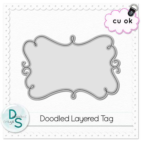
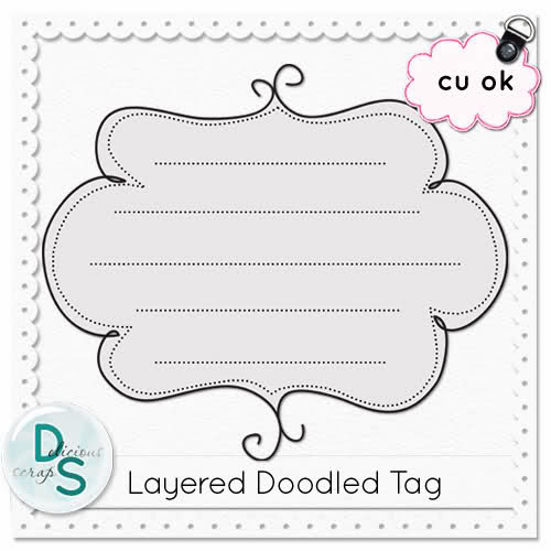
So I searched for a doodle frame or tag and came upon this fabulous website: Delicous Scraps. She's exactly what I was looking for. There's a ton of free doodle tags, plain pattern background wallpapers.

Here's a few things she has to offer, for free (click on picture to be taken to the download page):


And if there's something you like that isn't listed for free, it's just 99cents in her store!

In the end, I settled on this doodle tag of hers.


I did 4 different layers of the solid border tag from the 3 main colors of my pallette plus the black/slightly paler underline. And I added the other 2 colors from my pallette as the dotted borders, which are way less dominant, and actually hard to tell the color, but I find it finishes off well.

I wrote in the blog name with the font Simply Glamourous. I love how the capital letters are so big and fancy. I tried a few different fonts before this one, but once I tried this one I knew it was the best and I didn't need to look anymore.

I wanted to give the letters a bit more dimension so I copied the font layer and put it in the back of the first moving it slightly to make the lettering bolder and changed the color to a paler version. I often do this to text to make it pop more.

And then I had a logo:

Continue Reading...

Pages Navigation: Graphics

Continuing from where I left of in the last post about Pages Navigation organization... Now that I know what I want the labels, or pages, to be, I also had a very defined way I want them to appear and look.

I wanted them to look like file tabs, like in filling cabinets, but also be a bit whimsical and not the simple file tab shape we're used to. After some doodling on a piece of paper (I'm not very good at hand drawing things, or being creative with drawing), I managed to draw up some pretty cute looking tabs, don't you think?!


I scanned the piece of paper and opened it up in photoshop. I wanted to try to extract the shape somehow, but that didn't work out too great. I tried selecting the shape (ctrl + click on the layer and it selects the black part) and then painting the selection black, but again that didn't work very well.

So in the end I ended free hand, or free mouse drawing over the shape I had scanned. I was also able to correct when it wasn't quite as smooth as I wanted. I also tried a few thickness and settled on the medium one. It was more pixelated than I wished it was, but once it's the size you see on the blog, then it really doesn't show that much. This makes me want to try making vectors instead, then I wouldn't really have pixels. But I don't want to learn that right now, so this will have to do.

Then I wrote in my tabs, with the font Pea Ashlee Renee I made the font as big as I could while keeping it uniform for all of the labels.

Finally every label got treated to a bit of color by duplicating and coloring the tab doodle, and tilting it a bit so the black tab also shows underneath. I tried just having the colored tab but I dunno, I find with the black one in the back it gives off a better doodle vibe, which is what I really wanted.


The only thing I'm not entirely happy about is that because I freehanded the tab outline, it's a little pixelated and not as smooth as a vector art would be. I'm looking into doing the doodle with Adobe Illustrator, which should help make the outline more fluid and hopefully less pixelated.

Anywho, the real magic of these tabs is in the coding and behavior of these graphics on the webpage. Normally, they appear a little transparent, so that they don't command too much attention, but are still visible. But when you hover over them, or click on them, they become fully opaque (no transparency) and move up just a bit. It was super easy to do, too, just change the positioning and transparency on hover! Go ahead, try hovering over them or holding down your finger on them. I'm pretty proud of myself!


One part of the header down, 4 to go!
Continue Reading...

Choosing a Color Palette

I mentioned a while ago now that I wanted to write about choosing a color palette, but have been putting it off because I wanted to code more. Now I want to get it out of the way.

Now, all time I designed my blog I chose a scrapbook kit and that pretty much dictated what my color palette was going to be. This time around, all the elements I found that I liked were just plain overlays, doodles, etc that were just borders without a predefined color.

Also, maybe I didn't find a scrapbook kit I liked this time around because the color palette was off. Anyway, I had to choose my own colors to design with. Where to start??

I looked through Design Seeds to find a scheme I liked. I copy pasted the ones I liked into OneNote. I quickly realized that the other I liked were very colorful, and not shades of the same color, or couple of colors. Not surprising, I LOVE color. The more the better.

The thing was that I wasn't satisfied with any one image and color scheme. I wanted to mix and match. But that doesn't always fit together. I picked one image that I liked best and that I wanted to use the most of its colors, it was this one:


I started an image in photoshop a made circles of the colors. Then I went and found more images, that already had at least one of the colors I was looking for, and others that weren't in the first image, and copied their colors into the same photoshop major collage, as I'll call it. I must have used about 10 different images, and in the end I had this collage of colors:


Naturally, that was way too much! I had a hard time finding the right green and blue. So I picked the ones that were my favorite, then crossed out the colors that didn't match well, or were slightly off, and in the end I ended up with this smaller collage for a color scheme:


Still, 9 colors is a lot!! But there are 5 (or is it 6?) major colors, and some tones of the main/favorite 3. I plan to/have been doing my design mostly around the 3 main colors: the pink (my very favorite color in the scheme, thought it would be the orange, but no!), the blue, and the orangey yellow. The pruple and the green are more for when I want more colors instead of more tones (I'll use them when I need to make a list of similar elements, like the follows buttons). They are the colors that are featured prominently in the logo, which was the first piece of graphic design I made up, and what's setting this tone for the rest of the graphics.


I'm still debating whether I do a rough tutorial for how I made the header graphic. I played around with photoshop until I was happy, mostly, but maybe there are some tricks one might find helpful if they are doing their own graphic elements (FYI, I am not that great with photoshop, or graphic design...). At the same time, I don't want anyone copying my effect, so yeah... If you got any questions as to how I did it with photoshop (I think if you look at the graphic long enough you can see what I did) just ask in the comments :)

So with that, the theme I'm going for is: doodly, swirly, colorful, fun, whimsical. At first I thought I'd be outlining everything in black, but as I go along I find myself removing that aspect more and more- it's just too harsh. I'm still using it for some elements, but dulling the blackness down a bit, either by using a more charcoal color, or just simply decreasing the opacity of the black layer.
Continue Reading...

Header Layout

When I started thinking about this new blog design, I knew I wanted to make better use of my header. The space above the fold is very precious real estate, it's the first bit of your blog a reader sees, it sets the tone and feel of a blog.

As much as I loved my old header, it was just an image, and it was not very useful in any other way. Ok, I did have a menu below it, that was useful, but that's it.

It's become more and more of a trend to put different elements right within the header, for ease of use to the reader. Social media icons, email subscription, search bar are all a common part of the header nowadays.

But I also find that everyone does it the same way. I wanted to incorporate more into the header, but make it different than what we're used to seeing on other blogs. I needed take it up a notch, and make it just a little more fun.

I also gave a lot of thought to how the various elements in the header would rearrange based on the screen size; for big screen PCs, tablets, and smartphones. I might just be really complicating things! We'll see. I've been putting off tackling the header because of this; I just don't know if and how it will work.

But enough procrastination, I had to start somewhere.

First things first, allow more gadgets into the header part of the blog layout. This tutorial will explain how to do that, and a little more. Easy peasy. Then you have to tweak the sizes and play with floats as you add new gadgets to make it go where you want it to.

What I decided to add to my header are the following: logo, pages menu, tagline, social media buttons (including follow buttons RSS and email), search bar, and navigation bar (for content, as oppose to the pages menu).

Don't get me started on knowing to do a pages/menu bar, vs/and a navigation bar. I've thought a LOT about how to organize the blog, and I might still change things around; I'll probably write about that at one point. Navigation and blog organization is a HUGE thing for me!! And it gets all the more trickier with responsive design.

So, after a lot of thinking, at non appropriate times... (it really gets all consuming this blog design thing!), I've come up with the following layout for the blog, at desktop resolution:


I know it's busy. But hopefully I will be able to make it really pretty, functional, and... flowy, for lack of a better term. There's gonna be lots of trial and error!!

Now that that's done, I gotta do the graphic elements for the different parts. I'm a real big fan of hover effects, but I'd like the hover effects to be achieved with CCS(3), so I don't have to have 2 different images, and so it saves on load times. I've got a lot of great ideas, especially from this article: . It. will. be. AWESOME! I'll also probably be using effects like opacity, background color (with transparent elements in the image so the background shows through), make an image bigger.

BUT, and this is the sad part, I recently realized that tablets won't be able to see all my cool hover effects. sniff sniff. I'll probably try out the :pressed pseudo class (pseudo element? can't remember which is which right now), at least there will be the hover effect for the split second someone touches the button on a touchscreen. And probably :active too. Same effect at active as hover and pressed. That is the plan!

Now the thing will be not to overdue it. I think there's gonna be a fine line, and I'll probably be walking RIGHT on it's edge. I REALLY LOVE hover effects!!

TBC...
Continue Reading...

Setting the Body Background Image

The background image, or graphic, was one of the first graphic elements I made for the new design. I knew I wanted I pattern, and for it to be predominantly white, yet still quite colorful.

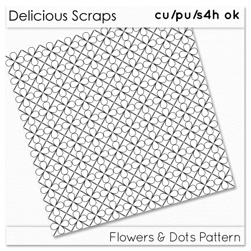
I'd found this graphic designer, Delicious Scraps, and I loved her stuff because you could use them to create your own graphics with them using your own color scheme. Perfect! Exactly what I needed since I hadn't yet found a scrapbook kit with a color scheme I liked and elements I was longing for. And I can pretty much guarantee no one else will have the same background as me!

So, first order of business: make the background image. Oh wait, back track a second. First order of business: choose a color theme!! Ha! Ok, well since I've already started with this post, I will cover how I chose my color scheme in an upcoming post, that sound good?

Ok, second order of business: make the background image. I looked through all the free pattern templates at Delicious Scraps and chose the one I liked best. This one to be precise:


Curtesy of Delicious Scraps

I wanted each layer of circle flowers to be a different color (the solid vs the paller one), and the dots an other. They all come in different files when you download the template. But I could not figure out intuitively how to do it in Photoshop! I thought I'd be able to do it with the overlay property, but it did not give me what I wanted at all!!

So I turned to all mighty Google, but I wasn't sure exactly how to phrase what I wanted to do. My first couple of searches came out fruitless, and I was almost ready to give up when I came upon this tutorial (for digital scrapbooking). I almost discard it because there were no pictures and it was using a different version of photoshop than me, but I figured I'd better try, and it worked!! Exactly what I wanted!!

I was now able to color every layer a different color, and because they had a transparent background, I could easily put them one on top of the other. Hooray, background graphic: Check!

With the background image in hand, I had to figure out how I wanted to place it. Here's a good tutorial to know your choices: How To Use a Background Image for Your Blog .

I wanted my background image to be scalable, proportional to the width of the window of the browser, since I'm going for a responsive design. I don't know if I'm making sense... I knew from my past (current?) background image that it looks slightly different for every device/resolution seeing my blog; it's set to background fixed and no-repeat. Someone with a big screen/resolution (Desktop computer) would see quite a bit of the colored part of the background (right, below) and that's the way I intended it to look like when I designed it; whereas someone on a smaller screen/resolution like a 15" laptop (my work laptop; middle, below) would have the background cut off where the lacey borders are and barely see the rest of the colorful background. And who knows what someone on a tablet or phone would see, probably not much if it follows the trend. (Note to self, check on bf's tablet and iPhone)

Click to enlarge in LighBox

The point is, I don't want the flowers to look huge in the background of a smartphone. Which is what I think it would do if I code it the same way as I've previously coded it. I also needed to figure out the biggest size of monitor it would be seen on. If I didn't make the image wide enough for the biggest screen, then there would be white space somewhere to compensate.

With that in mind, I thought my best bet would be to make the background image itself responsive, but was it possible? Apparently, with the new CSS3 rules, it is! Check it: CSS3 backgrounds. It would still mean that anyone with an older browser would not see it properly, but I think the majority update their browsers, right?

So here we go. Try 1, I set background image to fixed, no-repeat and a width of 100%. BTW, the image I made is 2000 px by 1000 px. And I always prefer fixed, I don't like it when it scrolls, I find it too distracting, especially when it's a busy pattern.


Please don't mind that the text is unreadable now. I'm fixing it after, and it's quite easy: just color the background of the main sidebar and header containers white.

Problem numero uno: If you're on a widescreen viewing the blog, the background isn't tall enough to cover the whole height of the screen! Which means the background image needs to be higher than it is wide for widescreens in landscape mode. But, thinking ahead, for portrait mode, then I would need it to be wayyyyyyy higher than wide, which would make for a huge file. There's gotta be an other way. (If you see how to fix it at this point, unlike I did, you can skip to the end ;) )

Try #2: Let's just see what it would look like without specifying the width 100%. (I'm really kicking myself for not thinking of the right fix!!)


Ok, well it fixes the above problem (I think, can't check on more devices...), but I don't like the size of the flowers, I really liked them smaller. And anyway I really want it responsive. Even if I were to adjust the image to have a higher density of flowers, it wouldn't scale.

At this point, I had to leave it be cuz I had other things to do. And then it came to me while I was taking a shower. It was so simple really, why hadn't I thought of it before?

Try #3: background width to 100%, fixed, repeat-y!!!! Duh! If it's not high enough, just repeat the pattern vertically, as long as it is a (seamless) pattern, it won't even show.

And with that, TADA:


Perfect! Actually, I might edit down the background image to the minimum repeating pattern, yet still keep the same width (might also make it less wide, and therefore the flowers slightly larger). That way, the file size of the background image will be smaller, and it should lead quicker. The background image and header image are the biggest graphics of my current blog, and what slows it down a lot right now.

One of my objectives with this design was to minimize the loading times by optimizing the images (not make them too big), and using more CSS to do what I want to do. Which is what my next task will be: make a white background for the containers containing text so they are easier to read. That or/and make the container sizes responsive. Should be easier enough.

Ha! Cuz adding the background was so easy, right?!

TBC...
Continue Reading...

Research,Pt 2

ACtually, you know what, if I'm to do this, I'm gonna do it right (well until I get too lazy to write it all down). I'll document here, or try to, everything I read and my thoughts. Maybe this could be useful for someone else, to see the thought process that goes behind designing a blog.

First let me say I am BY NO MEANS a proffesionnal. I don't even know if I can say I'm an amateur because I've done all of 2 designs. I will count my LiveJournal "blog", that is how I learned HTML and CSS and when I started learning how to tweak both, even if only very very rudimentarily. Then I did my own blog design at Color Me Domestic, but that was a lot more graphical design and I didn't touch too much the template code except to add a couple of widgets.

So now that that is out of the way, I'll say this. If you like this stuff (I mean coding and designing) then your hard work is all that stands in the way. I'm positive I will come out of this with my own personnal made template and graphic elements. It may take a while, because I have other things I SHOULD focus on (*cough* writing my thesis *cough*), but this is more fun.

Complete side note, I did something yesterday that is making me very very happy today, even though it is SUCH a trivial thing. What is it? I cleaned my keyboard. Yes I know trivial. I popped off every key and rubbed them all with 50% ethanol (I think, why does the bottle not clearly label what type of alcohol is in there?! that's what we need to do at the lab!). And then I cleaned under the keys. There were so.many.crumbs it was DISGUSTING. Anyway, so now as I'm typing this, because I only sorta have my "doighté" (I don't know the english term??? you know when you don't need to look at your keybooard when you type?) I CAN do it, but my eyes always go back to looking at the keyboard, it's just faster. Anyway, yes I am just so happy inside that it's so clean and beautiful. I need to do my boyfriend's keyboard next. It's 10X worst than mine was.

Ok back to topic. Which was....I don't know. Where was I going with this?? Ok, documenting I suppose.

I read this series yesterday, dating back to 2007, about the basics of a template. Quick enough read, and I think it's important to understand the anatomy of a template before you start messing with it. Here: http://www.ourblogtemplates.com/2007/06/tutorials-on-blogger-template-design.html

This doesn't mean I understand everything that is written in the template, but I know the parts, which is a good start. I think it's important to really UNDERSTAND this stuff, only then can you really make something truly unique.

Next. I need to read some articles from http://www.w3schools.com/ They were referenced over and over again in the series above, and they are still up to date. I think this will really help in know what the different codes are in the template, and the different options are for changing them.

My problem right now is that I have a ton of tabs open with different articles and series about web design. I kinda have ADHD when it comes to this stuff... Which is why I am referencing here what I find that I want to read later (I suppose I could also use Pocket)

And a couple more things I want to take note of if I need it later:
1. http://styletil.es/ Love the look of this site (the doodly-ness, that's what I want in my own blog, but I've not too good at drawing or anything, so we will see how that pans out). Looks like it would be good to help you establish what you want your blog or website to look like, the layout, the color scheme and the fonts, they mention.

2. Tools for responsive design http://www.hongkiat.com/blog/rwd-tools/ 50 of them

3. Blogger Template Design series start here: http://www.bloggerbuster.com/2008/01/creating-three-column-or-wide-two.html I guess. The baellabel (holy cow that was a messed up typo, I didn't even know at first what I was trying to say1) for the serie doesn't work, and there's no table of contents type page. Still seems like it's well written and easy to understand.


~~~
Alright, so I went through the CSS tutorials on W3schools. While I learned some tricks and got some ideas as to how to do some of the things I want to do in my template, it was not specific at all to blog templates. I do think I have a better grasp of how to write CSS, the difference between id and classes, but it also brought up a lot of questions. So I'm off to find something more relevant to blog template css. I think I'll read through blogger buster now. That might be all I do tonight.

Oh and I just found this free ebook about blogger template design, I think: http://blog.themeforest.net/installation-guides/free-e-book-the-blogger-template-book/

TBC...
Continue Reading...